Learning Targets:
8.SP.1
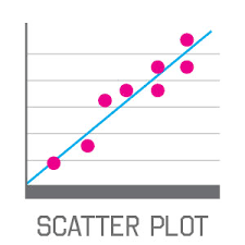
I can create a scatter plot representing the relationship between two data sets.
I can describe patterns in a scatter plot such as clustering, outliers, positive or negative association, and linear and nonlinear association.
I can describe how the patterns (clustering, outliers, and association) in a scatter plot relate to the context of the data.
8.SP.2
I can recognize whether or not data plotted on a scatter plot have a linear association.
I can draw a line of best fit to approximate the linear relationship on a set of points on a scatter plot.
I can judge the reliability of the line of best fit based on the closeness of the data points to the line.
8.SP.3
I can determine the equation of the line of best fit that approximates the linear relationship between the plotted points in two data sets.
I can interpret the y-intercept of the equation in the context of the collected data.
I can interpret the slope of the equation in the context of the collected data.
I can use the equation for the line of best fit to summarize the given data and make predictions about additional data points.
8.SP.4
I can create a two-way table to record the frequencies of bivariate categorical values.
I can determine the relative frequencies for rows and/or columns of a two-way table.
I can use the relative frequencies and context of the problem to describe possible associations
between the two sets of data.
Section 9.1 Scatterplots
Section 9.2 Lines of Fit
Section 9.3 Two-Way Tables
Section 9.4 Choosing a Data Display
8.SP.1
I can create a scatter plot representing the relationship between two data sets.
I can describe patterns in a scatter plot such as clustering, outliers, positive or negative association, and linear and nonlinear association.
I can describe how the patterns (clustering, outliers, and association) in a scatter plot relate to the context of the data.
8.SP.2
I can recognize whether or not data plotted on a scatter plot have a linear association.
I can draw a line of best fit to approximate the linear relationship on a set of points on a scatter plot.
I can judge the reliability of the line of best fit based on the closeness of the data points to the line.
8.SP.3
I can determine the equation of the line of best fit that approximates the linear relationship between the plotted points in two data sets.
I can interpret the y-intercept of the equation in the context of the collected data.
I can interpret the slope of the equation in the context of the collected data.
I can use the equation for the line of best fit to summarize the given data and make predictions about additional data points.
8.SP.4
I can create a two-way table to record the frequencies of bivariate categorical values.
I can determine the relative frequencies for rows and/or columns of a two-way table.
I can use the relative frequencies and context of the problem to describe possible associations
between the two sets of data.
Section 9.1 Scatterplots
Section 9.2 Lines of Fit
Section 9.3 Two-Way Tables
Section 9.4 Choosing a Data Display
